
- 1Nearly a third of France's population lives in the 20% of municipalities that the map ranks as most difficult.
- 2Half of France's municipalities are very strongly affected by at least one climate hazard.
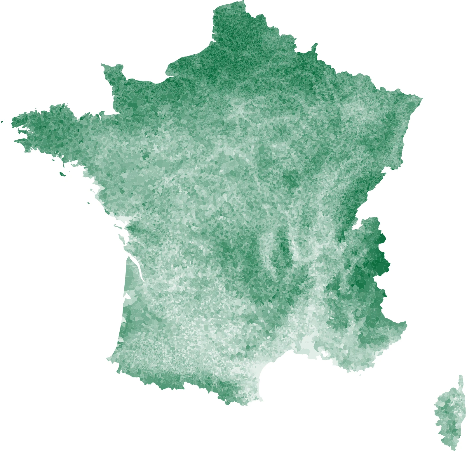
Six risk categories that can be ticked, a liveability score for each municipality, and the breakdown indicator by indicator.
1+2.7 °C in 2050: the guiding assumption in the French Environmental Code
Most of us have already come across maps of projected temperature, water stress or exposure to other climate hazards, but attempts at a multi-factor synthesis are much rarer. Inspired by the remarkable work of the post-urban movement, Où habiter en 2050 (in French), we at Projet Celsius have also tried to build a free, open-access tool that lets anyone find their way through the sea of available data and information.
We chose to use the French reference warming trajectory for climate change adaptation (TRACC). The State has adopted it, and it has been written into the Environmental Code since the ministerial order of 23 January 2026.

This trajectory projects warming in metropolitan France of +2 °C in 2030, +2.7 °C in 2050 and +4 °C in 2100. These levels are higher than the global average, because land warms faster than the oceans and Western Europe is among the regions most affected by that gap. They are also well above the targets of the Paris Agreement (+1.5 °C or 2 °C on a global average), because they are used to scale adaptation efforts, which are all the more relevant when planned around a climate path that is not too optimistic.
2Heat, water, clay, coast: the 6 risk categories
We selected six risk categories: heat, wildfires, drought and water resources (including clay shrinkage and swelling), flooding, coast and marine flooding and, finally, service deserts. Each category can be viewed on its own on the map, and colours blend where risks overlap.
Heat: one of the criteria that varies most between municipalities
Temperature and heatwaves are often the first things people think of when they think about climate change. The databases that cover heat out to 2050 define it by counting the days expected to exceed 35 °C and the nights that will stay above 20 °C (tropical nights).
Where France is least exposed, department by department
By 2050, the municipal average across 6 physical risk categories: heat, fires, drought and water, clay soils, flooding and coastal risks. This is a relative ranking of departments, rather than an absolute risk level.
A departmental average hides differences within it: a department with low exposure may contain highly exposed municipalities, and vice versa. The municipal map is read municipality by municipality.
Wildfires: physical risk versus regulatory tools
Mapping wildfire risk in relation to climate change is complex, and the scientific literature often addresses it for limited areas. We chose to start from observed fires: the national wildfire database has recorded just over 50,000 fires since 2006, municipality by municipality. A statistical model learns from these 20 years where large fires occur, using fire activity in the surrounding municipalities, the fire regime (Mediterranean, south Atlantic or northern), strong winds, building density and geographic position as predictors.
This level of risk is then raised in line with the increase expected by 2050 in the number of days on which weather conditions would make a newly started fire dangerous.
One data point is still missing: how much fuel is physically present on the ground. IGN, the French national mapping agency, produces a detailed land-cover map, and we were able to confirm that it clearly improves the model where it is available. But it currently covers only a quarter of France's departments (the administrative tier between municipalities and regions), and producing it nationwide will take several more years. We therefore did not use it, to avoid producing a map that is more detailed in some departments than in their immediate neighbours.
Finally, wildfire risk could also be assessed using the regulatory tools that prefectures (the State's local offices in each department) have put in place to take this hazard into account. That reading remains available on the map, but it is left out of the calculation of the liveability score (the map's overall score, on which a higher value means a less exposed municipality), because it reflects a department's administrative history as much as the physical risk. Coverage varies widely from one prefecture to another, from almost all municipalities around the Mediterranean to a little over half in the Landes and fewer than a third in Gironde, two departments that nonetheless saw the largest fires of the decade.
Drought and water
Drought is the most diffuse risk on the map. We look at it from three complementary angles: the number of days per year on which the soil is dry, the change in summer low flows in rivers, and the lengthening of the period during which those flows stay low.
This points indirectly to high stakes for agriculture, industrial cooling and access to drinking water. Urban vegetation is also under pressure, and it is itself an ally in adapting to climate change, through the cool islands it creates.
Clay shrinkage and swelling: the drought that cracks houses
This risk is less well known to the general public, even though it has become the second-largest item in natural disaster compensation (catastrophe naturelle in French), after flooding. Clay soils shrink in dry periods and swell when water returns, and this movement cracks the foundations of single-family houses built on shallow footings (damage often described in English as subsidence). It is an indirect but immediate consequence of climate change, and although not all soils in France are clay, more than half of the country's territory is affected.
We use the hazard map published by BRGM, which classifies soils into four levels, and 7% of municipalities fall in the high-hazard class.
Flooding: what is already known, and what is added
Flooding is the only risk on the map for which knowledge of the terrain well predates projections. We therefore cross-reference three official sources: flood-zone atlases, the risks recorded by the prefectures and approved prevention plans.
To this snapshot of the present, we add the expected change in flood flows by 2050, drawn from the same hydrological projections as for drought.
Coast and marine flooding: few municipalities, many residents
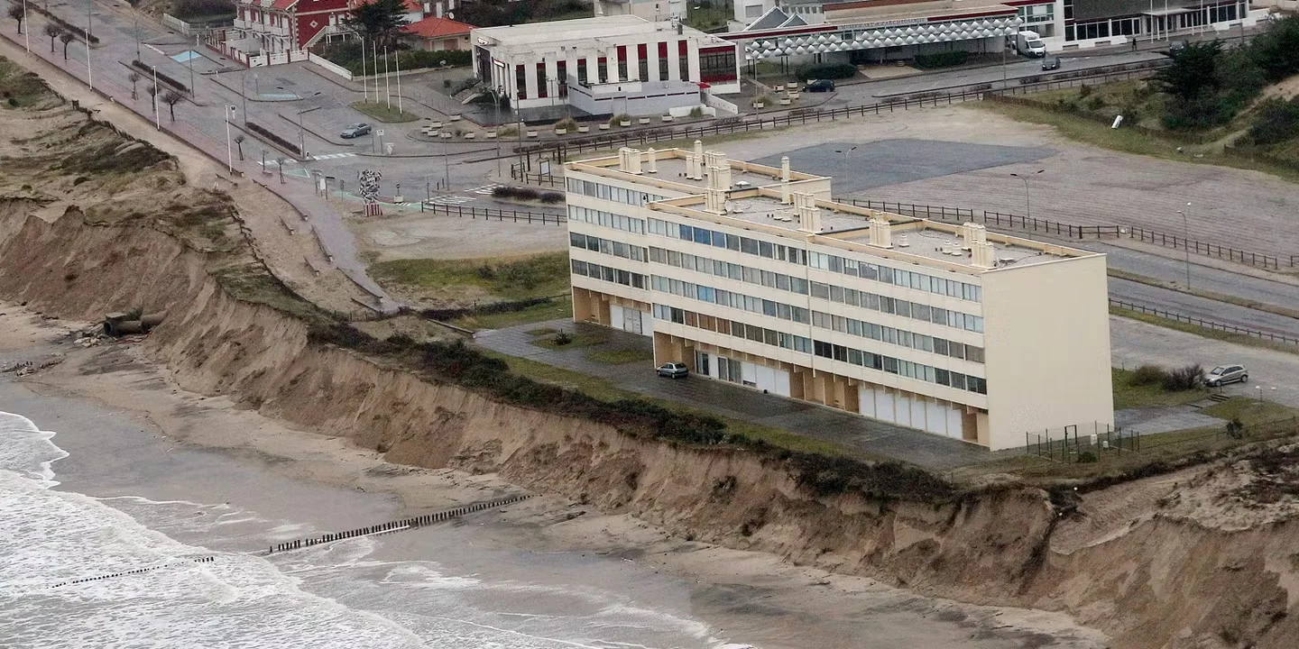
The coast concentrates two threats that need to be told apart. The first is marine flooding: a storm that coincides with a high tide sends the sea over the defences, and rising sea levels make that coincidence more frequent. The second is coastline retreat, a continuous process rather than an event: the cliff crumbles, the dune shifts and the coastline moves with them.
We look at four components, two per threat: the risk recorded by the prefecture and the existence of an approved prevention plan. A municipality can score anywhere from zero to four. Only 3.5% of French municipalities are affected, but they are home to more than one in ten residents. It is the most concentrated risk on the map and the one with the highest density of people at stake.
Service deserts: the only criterion that is not about climate
Beyond suffering or escaping hazards, living somewhere means being able to see a doctor, do the shopping, send children to school and reach a public service within a reasonable distance. We included a sixth category, which measures the density of facilities relative to population, using the permanent facilities database of Insee, the French national statistics institute.
This is the most debatable criterion on the map. First, it is not about climate, yet it carries as much weight as heat or wildfires. Second, it ignores the services of neighbouring municipalities: a village of 300 inhabitants 10 minutes from a sub-prefecture (a town housing a local State office) is shown as poorly served as an isolated village. We are keeping it for now because it gives a first indication of a municipality's resilience to hazards. We will supplement it as we find relevant additional data.
3How the six risk categories combine
Each indicator is converted into a rank, so a municipality's result is its position among the 35,000 French municipalities rather than an absolute score. A municipality ranked 90/100 is more exposed than 90% of municipalities. This choice has a direct consequence for how the map is read: a pale municipality on the map is not one without risk, only one that is relatively less exposed than the others.
The six risk categories are then averaged with equal weight, and the liveability score is built from that average. For reference, the median municipality scores 58.
This average has a known weakness, and we chose to correct it through the display rather than the formula. Taking an average means accepting that an extreme risk is diluted by the other five categories: a municipality crushed by heat climbs back up the ranking because it has no coastline and no flooding. To give a fuller reading, each municipality's profile separately flags the risk categories in which it is among the 10% most exposed municipalities in France.
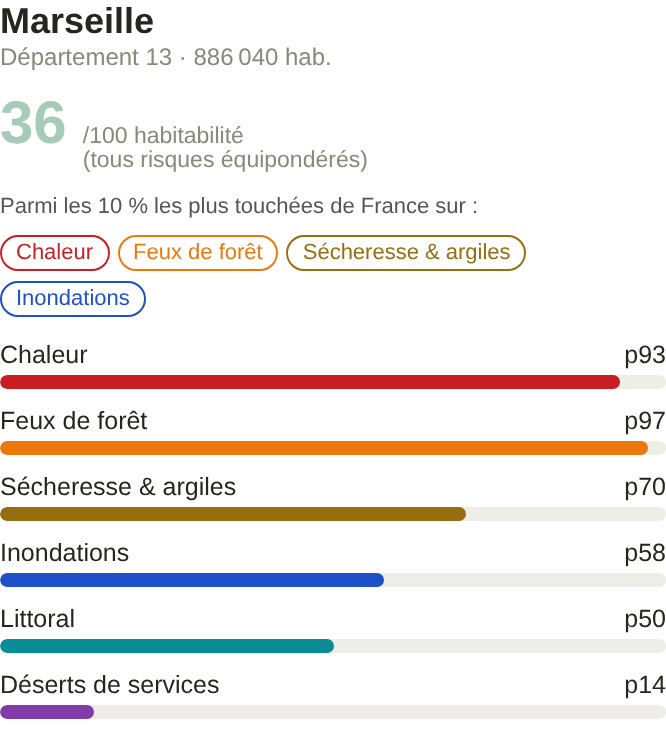
Of all municipalities, 4 in 10 have no flag, a little over 1 in 3 have one and nearly 1 in 4 have two or more. In total, more than 2 in 3 people in France live in a municipality flagged for at least one risk category.
A risk category can flag few municipalities while affecting many residents
At the threshold for the 5% most affected municipalities. On the left, the share of flagged municipalities; on the right, the share of residents affected. The gap between the 2 bars is the key information: it shows whether a risk affects places or people.
The gradient highlights the category with a gap of more than 10 points: flooding affects 2 times as many residents as municipalities, because towns and cities developed near water. Service deserts show the opposite pattern.
How many risk categories flag the same municipality
- 57.3% no flags
- 30.3% 1 only
- 12.4% 2 or more
4What the map does not tell you
It does not say where you should move. A highly exposed municipality that has planted trees, removed hard surfacing from its school playgrounds and secured its water supply will be more liveable in 2050 than a moderately exposed one that has done nothing. None of our indicators captures adaptation, because no national database measures it at present.
Nor does it show what happens inside a municipality. A municipality can be a village and 3 hamlets spread over 40 square kilometres, and the flood-prone valley floor and the hillside above it are shown in the same colour. At this scale, local contrasts are masked for now.
Finally, these are projections. They rest on a warming trajectory adopted by the State, on climate models whose median we take, and on relationships between climate and its effects that we assume to be stable.